Mother’s Day Word Cloud Card
A little creativity and some typographic rule-breaking can produce a really attractive design for a Mother’s Day card. Natural White Savoy 118# Cover from CutCardstock makes a great surface for letterpress printing this card, and as a time-saver, the stock is available pre-cut and scored to A2 size.

Today, I will demonstrate how to compose display types in your shop that you may not use often and arrange them in a word cloud. This technique is great for printing when you don’t have art to depict a specific event or topic because the types become the art.
This particular project takes a bit of planning. First, one must determine the words that will form the “cloud.” With an idea to make a Mother’s Day card, my wife and I did a little brainstorming and came up with six different words for “mother.” I wrote them on a piece of paper and then determined which font to use for each word, keeping in mind that I wanted a good distribution of the large/small, serif/sans-serif, and Roman/script types I have at The Norlu Press.
Setting the types in my composing stick was a bit different than the traditional method. Rather than choosing a line length, setting the stick, placing a slug and setting the types, with spacing as needed for a justified line of text, I justified each word on the measure that closest fit the types, with no spacing on the ends, then set the composing stick to that width (see below.)

If the types were just a bit short of a full measure, I added copper “thins” in between characters to keep the line from having annoying and unstable small spaces on the end (see before and after photos below.)

Once I justified each version of “mom” on its own measure, I arranged them on my imposing stone in the approximate size and shape of an A2 card. To avoid toppling the types, a makeup rule available from NA Graphics is extremely handy.

With the words in the general locations that I wanted them to occupy, I added spaces between them to push the text blocks outward and form a rectangle. As I did this, I realized there was a gap toward the bottom of my rectangular word cloud, so I returned to the brainstorm list of variations and set “MADRE” to fill that space (see below.)


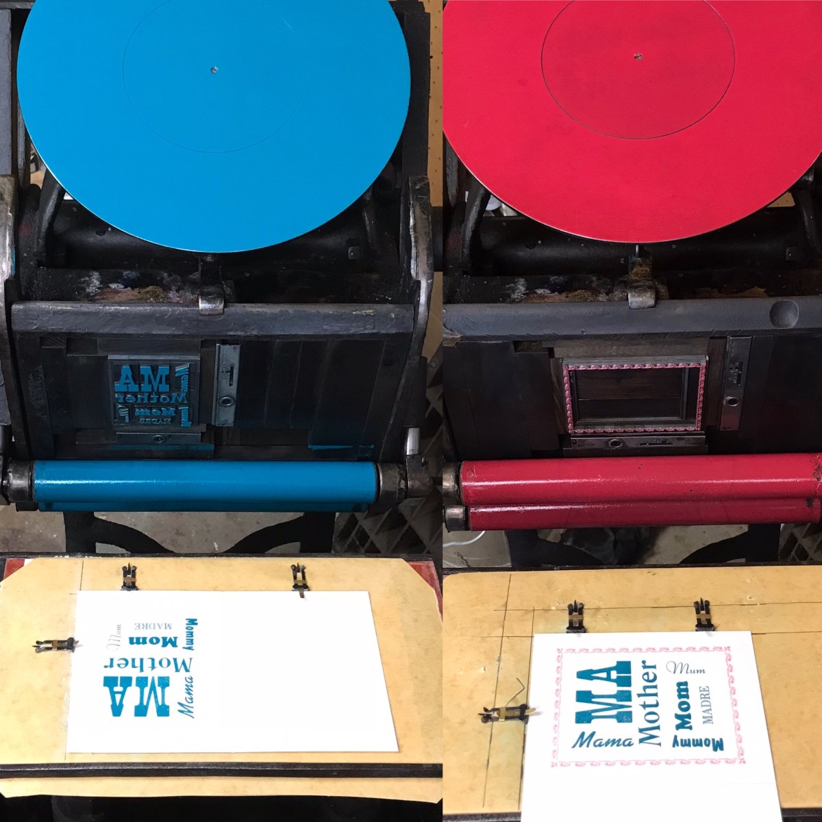
Press work for the front panel consisted of printing the word cloud form in teal ink. After seeing how the types looked on the card, I decided to add a flower border from M&H Type and printed it in pink, with the pink form canted 90 degrees for dip-feeding (see below.)


If you have designed a word cloud project, I would be very interested in learning about it and seeing your results. Please comment on this post and to see so many more creative ways to put ink on paper by following Cutcardstock.blog.


Great look at how the spacing works. I like the layout.
It would be easier to lay it out on a computer, but not nearly as much fun! Thank you for commenting.